

.webp)
SAPSA (Servicios Agrícolas del Pacífico S.A.) is a Guatemalan company dedicated to recruiting and managing agricultural labor for banana and sugarcane farms. Their service helps agricultural companies secure reliable, trained personnel while simplifying the operational and legal complexities of workforce management.
More than simply providing labor, SAPSA aims to build long-term relationships with both agricultural companies and field collaborators, ensuring stability, trust, and professional support throughout the process.
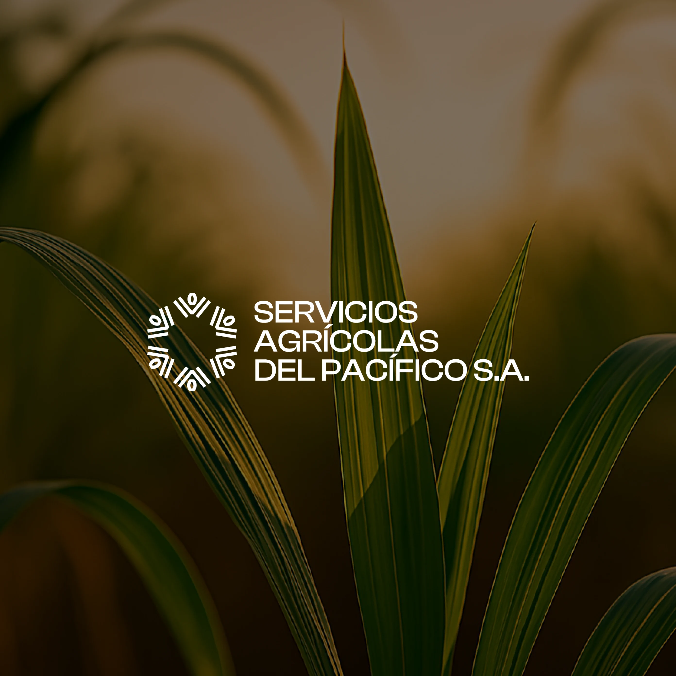
Alora partnered with SAPSA to create a modern brand identity capable of communicating the company’s human-centered approach while positioning it as a professional and reliable partner in the agricultural sector.
Although SAPSA was already an established company with more than 100 collaborators, its existing visual identity no longer reflected its values or the scale of its operations. The previous logo relied on generic agricultural symbols that did not represent the company’s true focus on banana and sugarcane production.
The challenge was to design a brand identity that felt modern, warm, and human, while maintaining the professionalism and trust required by agricultural companies and operational managers who rely on SAPSA’s services.
The new brand needed to communicate credibility to decision-makers while also resonating with the workers who represent the company in the field.

.webp)
The conceptual foundation of the brand was built around the idea “Sembrando futuro” (Sowing the future).
In agriculture, every day of work represents an act of planting—not only crops, but opportunities, relationships, and long-term growth. SAPSA plays a key role in enabling this process by connecting companies with the people who cultivate the land.
This concept guided the entire brand direction: positioning SAPSA as a company that nurtures progress, values its collaborators, and contributes to the sustainable growth of the agricultural sector.
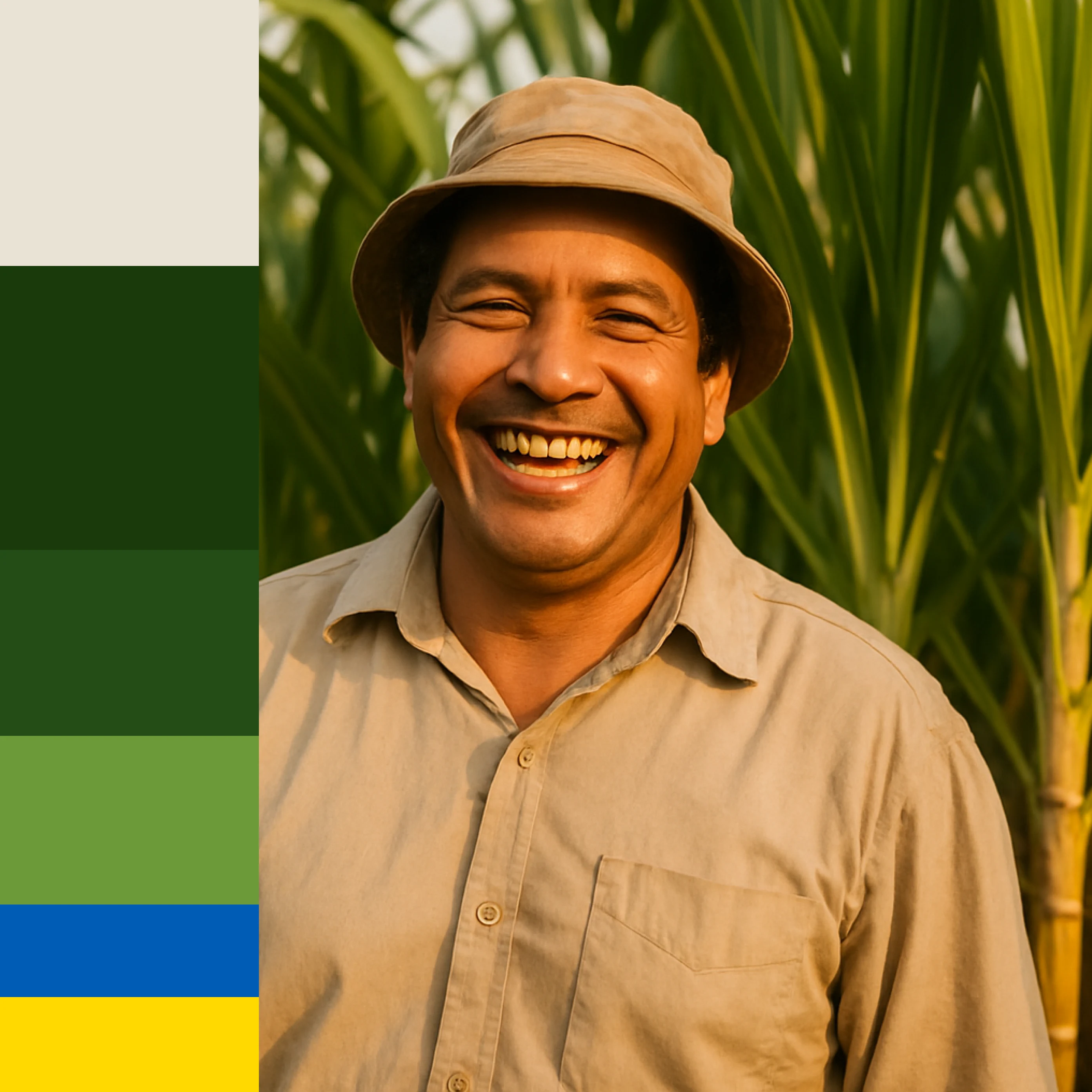
The visual identity translates the concept of growth and cultivation into a minimal and contemporary symbol inspired by the seed.
The icon represents both agricultural planting and human progress, reinforcing SAPSA’s commitment to the people who work the land and the companies that depend on them.
The color system is grounded in natural tones associated with agriculture and trust. Greens represent growth, stability, and connection to the land, while complementary tones such as yellow and blue add warmth and clarity to the visual language.
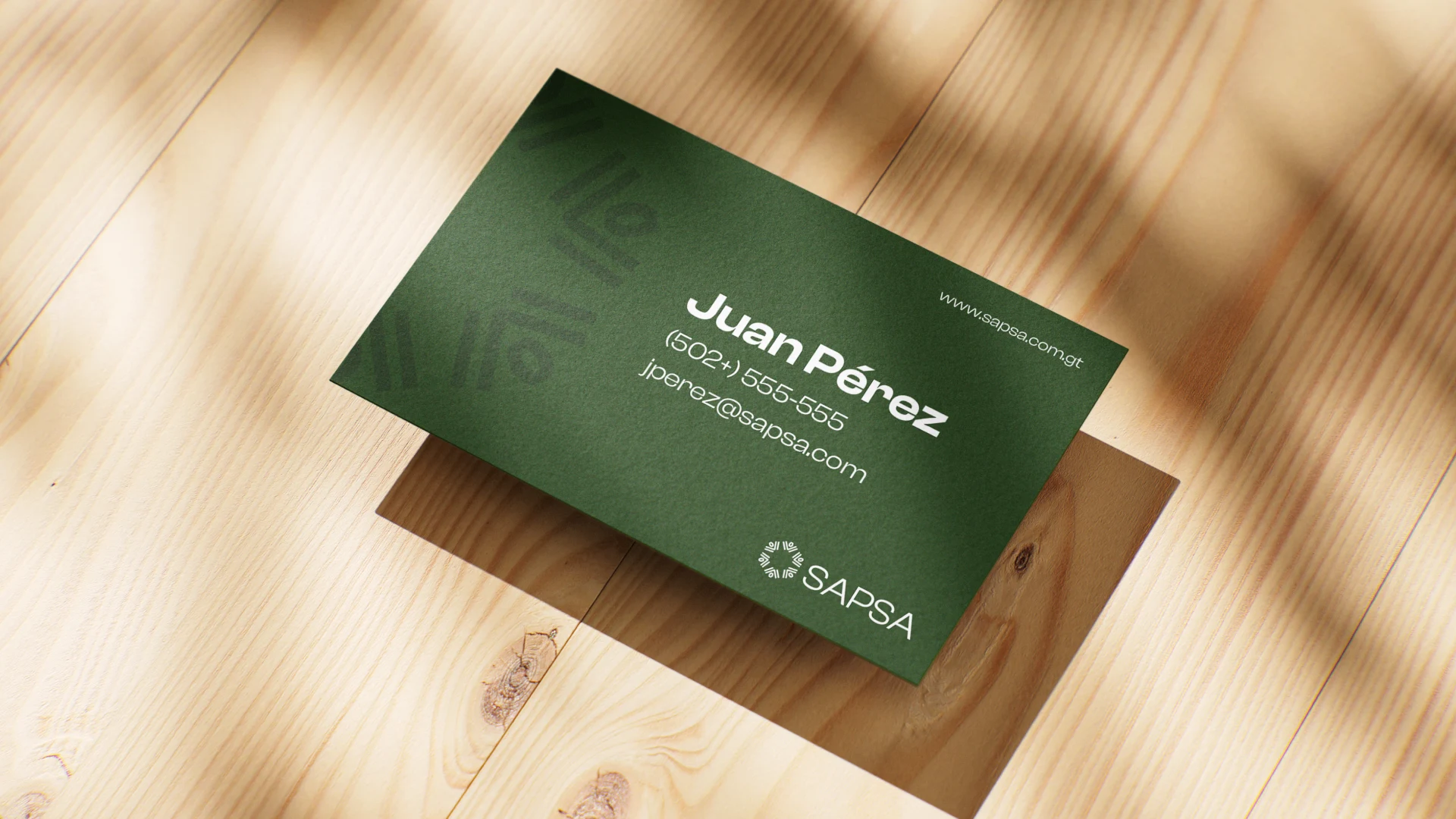
The typography combines a modern display typeface for headlines with a clean sans-serif for body text, creating a balance between approachability and professionalism.
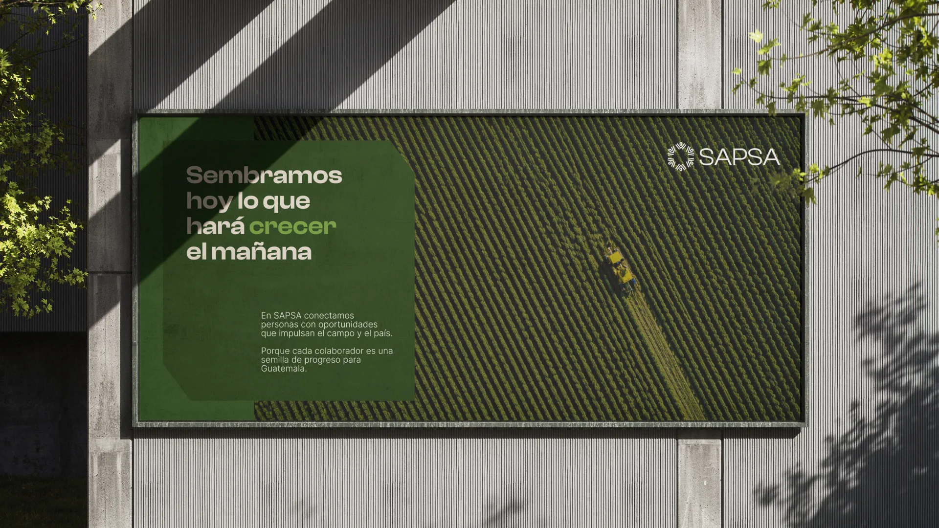
The resulting identity system is flexible and adaptable across multiple touchpoints—from uniforms and printed materials to digital platforms and signage.
.webp)
The new SAPSA brand positions the company as a modern, human-centered partner within the agricultural ecosystem.
By combining a meaningful concept with a clean and contemporary visual language, the brand communicates trust, professionalism, and commitment to the people who cultivate the land.
SAPSA now presents itself as a company that not only provides agricultural workforce solutions, but actively contributes to building a stronger and more sustainable future for the sector.
.webp)


.webp)